DIGITAL MARKETING SERVICES
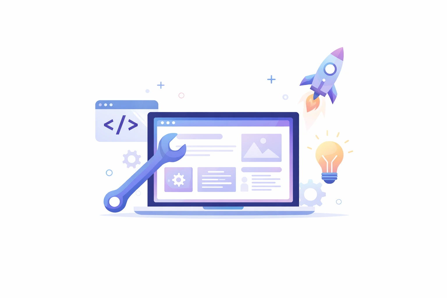
Convert Visitors Into Customers With Powerful Responsive Web Design Services
Your website is often the first impression customers have of your business. 4P Wisdom delivers professional responsive web design services that work flawlessly on every device. We create stunning, conversion-focused websites that engage visitors and drive measurable business growth.
Build Your Brand with
Over 5.6 billion people actively use the internet, representing 67% of the global population. Approximately 78% of shoppers research online before making any purchase decision today. About 77% of business buyers research thoroughly before contacting sales representatives ever. Modern customers access websites from smartphones, tablets, laptops, and desktop computers throughout the day. Your website must look perfect and function seamlessly across all screen sizes always. Our responsive web design services ensure every visitor enjoys an optimal experience.

Why Your Business Needs Professional Services
Mobile Traffic Dominates Internet Usage Today
Over 60% of all website traffic now comes from mobile devices worldwide. Google prioritizes mobile-friendly websites in search results through mobile-first indexing algorithms today. Websites that don't work well on phones lose customers and rankings immediately.Responsive design automatically adapts your website layout to fit any screen size perfectly. No more pinching, zooming, or horizontal scrolling that frustrates mobile visitors constantly. One website works beautifully everywhere, saving development time and maintenance costs significantly.
Improve User Experience Across All Devices
Visitors leave websites within seconds if pages load slowly or display incorrectly. Responsive web design services create consistent experiences regardless of how customers access you.Intuitive navigation and readable text keep visitors engaged and exploring your content.Touch-friendly buttons and forms make mobile interactions smooth and frustration-free for users. Fast loading speeds on cellular networks prevent abandoned sessions and lost conversions. Happy visitors stay longer, engage more, and convert at higher rates consistently.
Boost Search Engine Rankings
Google explicitly rewards mobile-friendly websites with better search rankings and visibility today. Responsive design is a confirmed ranking factor in Google's search algorithm system.Websites that fail mobile usability tests get penalized in mobile search results.Single URL structure for all devices makes crawling and indexing more efficient. Consolidated link equity strengthens your domain authority instead of splitting it across versions. Better rankings mean more organic traffic and qualified leads for your business.
Increase Conversion Rates and Revenue
Frustrated mobile users abandon websites and purchase from competitors with better experiences. Responsive web design services remove friction from the customer journey on devices.Easy checkout processes and readable product information boost e-commerce sales dramatically today.Form completion rates increase when fields and buttons work properly on touchscreens. Clear calls-to-action guide visitors toward desired actions regardless of their device type. Better user experience directly translates to more leads, sales, and business revenue.
Future-Proof Your Website Investment
Responsive design automatically adapts to future devices without requiring complete website redesigns. Your investment remains effective as technology and user behavior continue evolving forward.Maintaining one responsive website costs far less than managing separate desktop versions. Updates and content changes apply across all devices simultaneously, saving time significantly. This scalability protects your investment and reduces long-term maintenance expenses dramatically.
Stronger Brand Credibility and Trust
A professional, well-optimized website instantly builds trust with your visitors. When users find your site fast, easy to navigate, and visually consistent across all devices, they perceive your brand as more reliable and credible. Modern design standards, clear structure, and optimized performance signal professionalism and authority in your industry. Businesses that invest in quality digital experiences often gain higher customer confidence, more repeat visitors, and stronger long-term brand loyalty. A trustworthy website not only attracts new customers but also strengthens relationships with existing ones.
Our Comprehensive Services
Custom Website Development
We create unique, brand-aligned websites tailored specifically to your business goals and audience. Every design element gets crafted to reflect your brand identity and values clearly. Custom layouts ensure your website stands out from generic template-based competitor sites.Our designers research your industry, competitors, and target customers before starting design work. Wireframes and mockups visualize site structure and user flows before development begins. Collaborative feedback rounds ensure the final design exceeds your expectations and requirements.Mobile-first design approach prioritizes smartphone experience, then scales up to larger screens. This ensures critical content and functions work perfectly on constrained mobile displays. Progressive enhancement adds features for larger screens without compromising mobile performance.
Mobile-First Development Approach
Modern web development must prioritize mobile users who represent the majority of traffic. We code websites starting with mobile layouts, then enhance for tablets and desktops.This approach ensures core functionality works flawlessly on every device size and type.Touch-optimized interface elements make tapping buttons and links easy on small screens. Finger-friendly spacing prevents accidental clicks and improves overall mobile usability significantly today. Swipe gestures and mobile-specific interactions feel natural to smartphone users browsing sites.Performance optimization reduces file sizes and requests for faster loading on cellular networks. Lazy loading defers off-screen images until needed, conserving mobile data and bandwidth. Service workers enable offline functionality and faster repeat visits on mobile devices.
E-commerce Website Design
Online stores need responsive designs that make shopping easy on any device type. We optimize product pages, checkout flows, and shopping carts for mobile conversions. Large product images, readable descriptions, and simple navigation drive mobile sales effectively today.Mobile commerce accounts for over 50% of online retail transactions globally now. Touch-friendly product filters help mobile shoppers find items quickly without frustration or delays. One-page checkout reduces friction and cart abandonment on smaller mobile screens significantly.Responsive product galleries showcase multiple images without cluttering the limited mobile screen space. Mobile payment integration includes Apple Pay and Google Pay for frictionless checkout. Security badges and trust signals display prominently, building confidence on all devices.

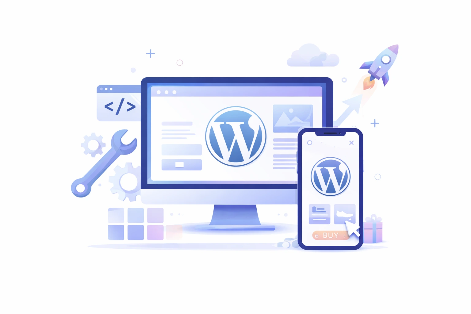
WordPress Responsive Design
WordPress powers over 40% of all websites, making it ideal for businesses. We create custom responsive WordPress themes that look stunning on every device. Full control over design and functionality without limitations of pre-built generic themes.Our WordPress sites include intuitive admin panels, making content updates simple and easy. Mobile preview tools let you see exactly how changes appear across devices. Plugin integration adds functionality while maintaining responsive performance and mobile speeds always.WooCommerce integration transforms WordPress into a powerful, responsive e-commerce platform for selling. Membership sites, learning management systems, and directories work perfectly on mobile devices. SEO-optimized code structure helps WordPress sites rank well in search results.
Landing Page Design
Conversion-focused landing pages need responsive design to maximize lead generation and sales. We create mobile-optimized landing pages that load fast and convert visitors effectively.Clear headlines, compelling copy, and prominent CTAs work perfectly on small screens.Form optimization reduces fields and uses mobile-friendly input types for easy completion. A/B testing capabilities let you optimize landing pages based on actual performance data. Integration with email marketing and CRM systems captures leads automatically from devices.Video backgrounds and animations scale appropriately, maintaining impact without slowing mobile performance. Social proof elements like testimonials and trust badges display effectively on phones. Analytics tracking reveals how visitors interact across different devices and screen sizes.
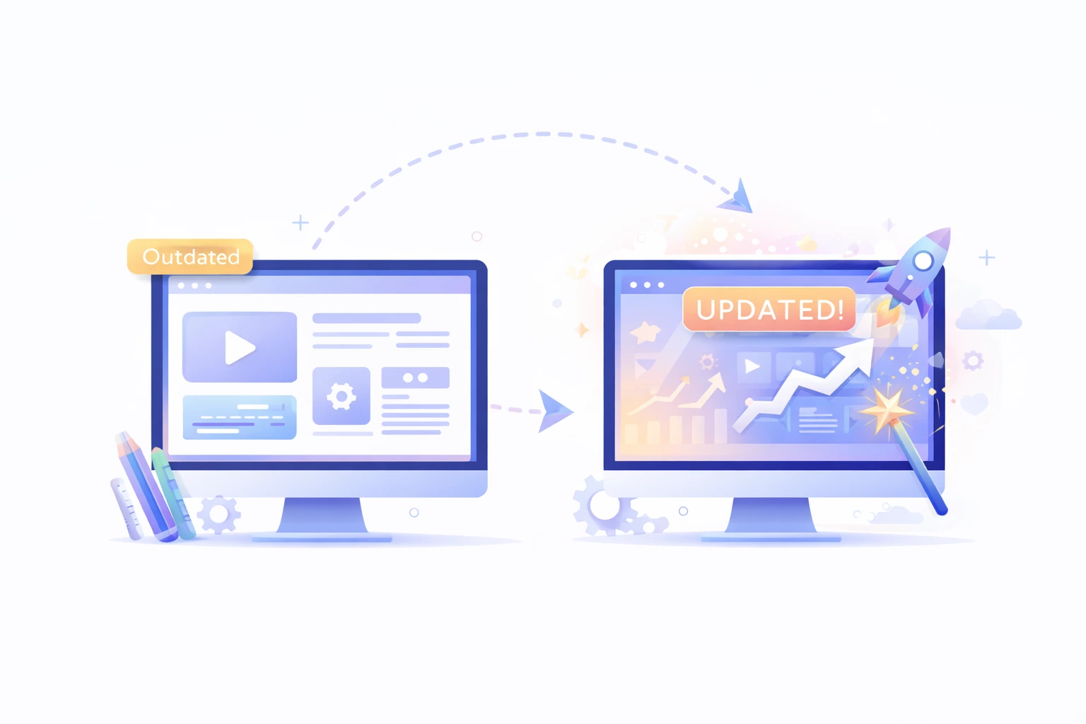
Website Redesign Services
Outdated websites hurt your brand and lose customers to competitors with modern sites. We redesign existing websites with responsive frameworks that work on all devices.Content migration preserves SEO value while improving structure and user experience significantly.Redesign projects include comprehensive audits identifying problems with current website performance and design. We preserve what works while fixing issues causing poor conversion rates or engagement. Redirect mapping protects search rankings during the transition to your new site.Legacy system integration ensures your redesigned site connects with existing business tools. Training helps your team manage and update the new responsive website confidently. Post-launch support addresses any issues and optimizes based on real user data.
Conversion Rate Optimization
Responsive design means nothing without high conversion rates across all device types. We analyze user behavior on mobile and desktop to identify conversion improvements.Heat mapping and session recordings reveal how visitors actually interact with pages.Mobile-specific optimization addresses the unique challenges of converting visitors on small touchscreens today. Simplified forms, larger buttons, and clearer CTAs boost mobile conversion rates dramatically. A/B testing experiments identify which responsive design elements perform best for conversions.Speed optimization removes milliseconds that impact conversion rates and user satisfaction significantly. Image compression and code minification reduce page weight without sacrificing visual quality. Content delivery networks serve assets faster to visitors regardless of geographic location.

Key Features of Our Responsive Web Design Services
Fluid Grid Layouts
Our responsive designs use flexible grids that scale proportionally across screen sizes. Column layouts stack vertically on mobile, providing optimal readability without horizontal scrolling. Consistent spacing and proportions maintain visual harmony regardless of viewport width.
Flexible Images and Media
Images automatically resize to fit container widths without distortion or pixelation issues. Art direction enables serving different image crops optimized for each screen size. Video embeds scale responsively and work with touch controls on mobile devices.
Mobile-Optimized Navigation
Hamburger menus save space on mobile while providing full navigation access easily. Touch-friendly dropdown menus work smoothly without mouse hover requirements on phones. Breadcrumb navigation helps users understand the location within your site structure clearly.
Readable Typography
Font sizes scale appropriately, ensuring text remains readable across all device sizes. Line length and spacing are optimized for comfortable reading on narrow and wide screens. Web fonts load efficiently without causing layout shifts or performance problems today.
Fast Loading Speeds
Optimized code and compressed assets ensure pages load in under three seconds. Lazy loading defers below-fold content, improving perceived performance on mobile networks significantly. Browser caching reduces load times for return visitors across all devices.
Touch-Optimized Interactions
Buttons and links are sized appropriately for easy tapping without accidental clicks. Form inputs use mobile-specific keyboards for phone numbers, emails, and dates. Swipe gestures enable intuitive navigation through image galleries and carousels smoothly.
Our Proven Process
Largest Contentful Paint (LCP)
LCP measures how quickly your main content loads and becomes visible to users. Google expects pages to load the largest content elements within 2.5 seconds maximum. Slow LCP frustrates visitors, causing them to abandon your site for competitors.We optimize images, reduce server response times, and implement efficient code practices. Resource prioritization ensures critical content loads first, giving visitors immediate value quickly. Fast LCP improves user satisfaction, reduces bounce rates, and boosts search rankings.
First Input Delay (FID)
FID evaluates how quickly your website responds to user interactions like clicks. Google recommends FID under 100 milliseconds for optimal user experience and engagement. Slow interactivity makes websites feel broken or unresponsive, frustrating visitors trying to navigate.We minimize JavaScript execution time, allowing faster response to user input actions. Efficient code structure ensures browsers can process interactions without delays or lag. Responsive interactivity keeps users engaged and confident in your website's functionality always.
Cumulative Layout Shift (CLS)
CLS measures visual stability, preventing unexpected layout shifts that disrupt the user experience badly. Content that jumps around while loading creates frustrating experiences for visitors browsing. Google penalizes websites with high CLS scores in search ranking algorithms today.We reserve space for images and ads, preventing content from shifting unexpectedly. Font loading optimization eliminates text reflow that causes jarring layout changes during loading. Stable layouts provide smooth, professional experiences that keep visitors engaged throughout sessions.
Why Choose Us
We've designed and launched over 500 responsive websites across diverse industries successfully. Our client retention rate exceeds 92% because we consistently deliver exceptional results. Portfolio showcases demonstrate our ability to create stunning, high-performing websites that drive growth.
We design for mobile devices first, then enhance for larger screens strategically. This ensures your website works perfectly for the majority of users.Mobile constraints force focus on essential content and streamlined user experiences.
Every design decision considers the impact on loading speed and mobile performance carefully.We optimize images, minimize code, and leverage caching for blazing-fast websites. Performance budgets prevent feature creep from slowing down your responsive website.
Beautiful design means nothing without high conversion rates and consistent business results.We design user journeys that guide visitors toward desired actions on devices. A/B testing and analytics drive continuous optimization for better conversion performance.
You'll always know project status, timelines, and any challenges we're addressing proactively.Regular check-ins and demos keep you involved throughout the design process. No surprises, just a collaborative partnership producing excellent results for your business.
Launch day is just the beginning of our partnership with your business. We provide training, documentation, and support, helping you manage your website confidently. Technical assistance addresses issues quickly, minimizing any disruption to your operations.
FAQ
Frequently Asked
Responsive web design creates websites that automatically adapt to any screen size. One website works perfectly on smartphones, tablets, laptops, and desktop computers.
The time needed depends on the size, design complexity, and features required for the website.
We can audit your existing website to assess mobile-friendliness and responsiveness.
Yes, every website we create is built with SEO best practices from the foundation.
Responsive design improves SEO by meeting Google's mobile-friendly requirements for ranking today.